Search This Blog

Monday, February 13, 2012

Happy Valentine's Day alcohol ink style!

Hi everybody!

I'm going to tell you one of my deepest, darkest secrets. Are you ready?

(whispering) I don't like pink.

There I've said it! I'm the only woman in the known universe who hates the color pink. In fact, I'm not really into any bright colors. My favored color palette are those colors that people generally find really boring; like brown, dark blues, dark greens, etc. Pretty much any color you'd find in a flannel shirt.

So, as you can imagine, Valentine's Day poses quite a problem for me.

This year, I decided to tone down the usual pinks of the holiday with some reds, purples, and even a bit of brown. It's my version of compromise. :)


So I started with some glossy cardstock from Ranger. I just love alcohol inking! I love that you really can't mess it up, if you don't like the way it looks you just add different color and keep going until you do like it. I love foolproof crafting!


For this card, I used Ranger's shell pink, salmon, wild plum, red poppy, and snow cap.


I put a few drops of each (maybe a little less of the pinky colors) and a generous amount of blending solution on one of Ranger's felt pads. With the blending tool, I just started going crazy all over the piece of glossy cardstock.


Once I was finished, I heated it with a heat tool just because I am impatient. You can let it air dry too. I cut the cardstock down to 4 1/4 by 5 1/4, inked the edges with brushed corduroy distress ink, and put it on a pink card base. (Of course I inked the pink card base edges with the brushed corduroy too). :)


\Next, I inked up one of Tim Holtz's ticket stamps with the new festive berries distress ink and stamped it onto white cardstock. I inked the whole thing with the foam ink tool and brushed corduroy again, and cut the ticket image out.


I used a Viva Decor Pearl Pen in chocolate to freehand a heart onto the card and popped up the ticket into the center of the heart (but make sure to wait for the pearls to dry!).


And voila! A not quite so pink Valentine's Day card that even I am ok with ;)

Thanks for stopping by everybody!

Keathe

Friday, February 10, 2012

Make a flower Friday

One of my favorite things to do lately is to make fabric flowers. There are a number of ways to make them, and they are an easy and pretty way to embellish a page or project.

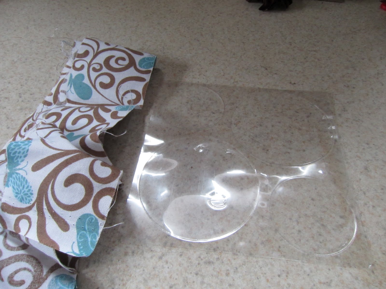
There are only two materials necessary to make today's flower; a strip of fabric and a large circle of glue (I used a gluber from Cosmo Cricket)

The glubers have a protective plastic sheet over them, you will want to cut away the dot you want to use and then peel off the protective sheet.


First you will want to tie a knot at one end of your fabric, and place it down in the center of your gluber.

Next, you will want to wrap the fabric into a spiral and place it around the knot, leaving no spaces. Keep wrapping the fabric and sticking down onto the gluber.


When you are ready to finish your flower off, tuck the end of the fabric underneath the last row of twisted fabric, and stick down. Cut off your end close to the flower.


To adhere to your project, just trim off any excess glue that wasn't used and peel off the backing of the flower. Stick down to your project and you are done! I used Ranger's Copper Perfect Pearls mist, and Vintage Photo Distress Ink to age my flower a bit, and then used it on this tag:


Everything I used to make this tag is sold by Cropsy Turvy, so let us know if you need any of these materials, or stop by and see us at one of the upcoming crops that we'll have a vendor booth with. Thanks for stopping by!

Keathe

Wednesday, February 8, 2012

Anniversary Canvas Card

Happy Wednesday, Scrap Fans! Today I'd like to share a "canvas card" I made for my parents 38th Wedding Anniversary. Since my mom always saves the cards I make her, I decided to make this one on a 5x7 canvas, to make it easier for her to display. I put a pocket on the back to hold the gift certificate.

I prepped the canvas with Vintage Photo Distress Crackle paint and then touched up the edges with Vintage Photo Distress Ink. I then stamped the "together" definition from the Stampin' Up! "Define Your Life' stamp set in black Archival Ink.


I matted the photo (a pic of my parents walking down the aisle following their ceremony) and adhered it to a photo mat made from a torn pieces of Coredinations card stock in Vintage Photo Distress by Ranger and Tim Holtz. I embossed the card stock with an Alterations Embossing Folder.
The tag was a #8 Manila tag sprayed with Tattered Leather Glimmer Mist by Tattered Angels. I distressed the edges with the Distressing Tool from Tonic and Tim Holtz and then inked the edges with Vintage Photo Distress Ink. I then sprayed some seam binding tape with Glimmer Mist to match the tag and added a piece of brown tulle. I adhered various pieces of ephemera including an Adage Ticket from Tim Holtz and some charms and found items.
I hope you enjoyed this project. Leave a comment to let me know what you would like to see in the future. Until then, Happy Scrapping!
~Patrice

Friday, February 3, 2012

Where Did The Time Go???

Ok, Seriously, I haven't posted since Halloween? Really? I had planned on taking some time off over the holidays, as my family has a business that is very seasonal and keeps me busy in November and December but what the heck happened to January?
I haven't been totally slacking. I did do a couple of make and take classes and I've been working to update my computer system for the upcoming crops as well as drooling over all the new CHA offerings and trying to decide what to add to our product line. So there has been some work getting done, just not the kind that makes for interesting blog posts.
I did, however, attend a one day crop at the Ogle Township building a few weeks ago where I had the chance to work on something just for fun. I went into it not really knowing what I was working on, other than I brought all of my Tim Holtz products and just wanted to experiment a little. The result was this layout, which I titled "time flies" to celebrate my tenth anniversary. I made the tag first, then decided it belonged on a page, so i kept going. I wanted to play with my new Crafter's Workshop templates and Glimmer Mists and the clock theme evolved. I was digging through my stash and came across the grungeboard wings, which brought to mind the old cliche "time flies" reminding me of a conversation my husband and I just had about our upcoming anniversary. Suddenly it was the perfect canvas to honor our ten years together and this page was born.
Hope you enjoyed the page and please stay tuned for more to come. Until then, Happy Scrapping!
~Patrice

Monday, October 31, 2011

Happy Halloween Scrap Fans!!


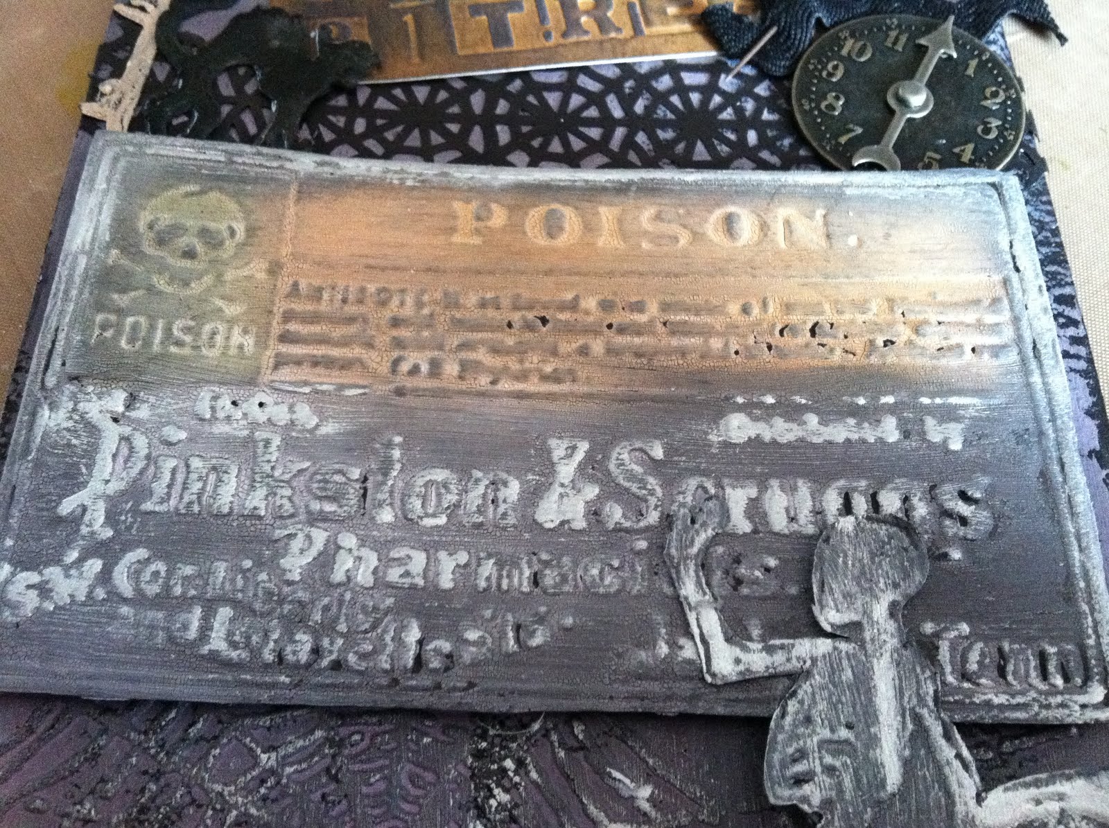
In honor of Halloween (and to play with some of my awesome Ranger products) I created this spooky tag decoration.

I started with a 6X12 piece of heavy weight card stock and cut the top edge with the Tim Holtz Alterations One the Edge Plaque & Postage die.

I then coated the entire piece with Tim Holtz Distress Crackle Paint in Picket Fence. Once it was dry, I inked the entire tag with Tim Holtz Distress Ink in Dusty Concord and the edges in Black Soot. I used the Tim Holtz Alterations Embossing Folders to emboss a spider web on the tag and then rubbed over it in Silver Rub and Buff. I used two other Alterations Embossing folders, cut out the images, and used the same techniques as I did on the tag and then rubbed Silver Rub and Buff over the raised images.


I decorated with various other adornments, including some ephemera from the Tim Holtz Ideology collection and a spider web border punched from a Martha Stewart border punch.

I used some Glossy accents to attach a piece of chain to the tag. I used Enamel Accents to coat the cat and I punched holes and placed eyelets and hung a chain with jump rings.


I hope you enjoyed these techniques. If you would like to learn more, you can contact us to schedule a class at info@cropsyturvy.com. Until next time, Happy Scrapping!

~Patrice

Monday, October 24, 2011

Neon Grunge!

I have no idea if there is a style called neon grunge out there already or not, but if there is, Patrice rocked it this week!  She may have made a brand new trend! 

Neon grunge comes about when you have a 13 year old girl who loves neon, and a not so 13 year old woman who does not. :)  How do you tone down those colors into something that looks awesome, while still leaving the neon in?  It's neon grunge!

Watch Patrice's video to see all the neat techniques she used in this album!


Thanks for stopping by!

Saturday, October 8, 2011

Faux Metal Technique

Hello Scrappy Friends! I want to share an awesome technique I found in a YouTube video by
Rach0113. It uses common construction materials in an uncommon way to create a fabulous industrial look. I was inspired to create a birthday gift bag for my dad using this technique and a re-purposed Verizon bag. Here is how I did it:


I started out with a piece of black chipboard, cut to size and glued on my letters. I used grungeboard letters by Tim Holtz's Ideology collection


I used Duck Brand Adhesive Drywall Joint Tape and cut and placed pieces randomly on my background.


I then cut Duck Brand adhesive, silver waterproofing tape into various sized pieces and layered it randomly over the entire piece of chipboard.


After the entire piece was covered, I used a brayer to smooth out the tape.


I branished around the edges of the letters with an embossing tool and rubbed over the areas of the drywall tape to reveal the pattern underneath. I used the embossing tool to scratch and poke dots in random places for an industrial look.


I covered the entire project with Black paint using an Adirondack Paint Dabber by Ranger.

I used a baby wipe to remove the top layer of paint, leaving it in the cracks, creating a more industrial, metal look.

To make the gift bag, I used a shopping bag from the Verizon store and covered it with Le Cirque paper from Graphic 45, then attached the Faux Metal "Happy Birthday" plate to the front.


I hope you have enjoyed this unique technique and can find a way to make it your own. Until next time, Happy Scrapping!!

~Patrice

Monday, September 26, 2011

Cambria County Christian School Crop

Cropsy Turvy will be at Cambria County Christian School Friday, September 30 and Saturday October 1 for their fundraising crop. Stop by to check out our new mini book and layout kits, papers by Simple Stories and a great make and take featuring the new Fall 2011 Distress Inks from Tim Holtz and Ranger. Hope to see you there!!

Cambria County Christian School
561 Pike Road
Johnstown, PA 15909-4209
(814) 749-7406


I don’t have an ‘INKling’ how to use these!

Ever find yourself standing in front of an ink pad display wondering why there are so many inks to choose from? What’s the difference between pigment and dye? Do I need different types of ink, or will one good one do the job? Can I heat emboss with any type of ink?

We’re here to answer all your ink questions.

Chalk Inks

Chalk inks are long lasting and fade resistant inks. They blend well and provide more of a matte finish. They dry rather quickly and are made permanent by heat setting. Clearsnap® makes a chalk ink in their ColorBox® line.

Dye Inks

Typical dye inks are waterproof, acid free and transparent. They dry very quickly and blend and dissolve well. Dye inks work well for general stamping and can be used on glossy or matte papers.

Cropsy Turvy carries several unique dye inks:

Tim Holtz® Distress Inks are a collection of 36 acid-free, non-toxic, fade resistant, water-based dye inks. They’re perfect for achieving vintage, stained, aged effects. Tim selected the colors and helped develop these inks to produce a realistic, weathered look on paper, photos and decorative fibers. Re-inkers are available in .5 oz. bottles with eye drop applicators. Distress inks are different from other dye inks in that they are water reactive and can be used to heat emboss, as they stay wet longer than typical dye inks.

Tim Holtz® Adirondack® Alcohol Inks are acid-free, fast drying transparent dye inks specially formulated to create a colorful, polished stone effect. Use on glossy paper, dominoes, metal, shrink plastic, glass, and other slick, non-porous surfaces. They are available in sixteen exciting 3-color palettes or 48 individual bottles and can be applied with an ink applicator, a fillable pen, or straight from the bottle. Alcohol Blending Solution is available for lightening colors and cleaning inks from non-porous surfaces.

Adirondack® Dye Ink Pads are rich, realistic earth tones, pastel lights and vibrant brights that coordination with the Adirondack product line. These inks are acid free and fade resistant, great for stamping and come in a 1 oz. reinker.


Pigment Inks

Pigment inks are thick, opaque and slow drying. They are acid free and more vivid than dye inks. They are also easier to clean. Pigment inks are fade-resistant and are great for heat embossing and air-dry on matte papers. Cropsy Turvy carries Adirondack ® Pigment Inks by Ranger Industries. They are available in 24 colors which consist of 6 brights, 6 lights, 12 earth tones and Pitch Black and Snow Cap. They coordinate with the entire Adirondack® product line and have half ounce reinkers.

Solvent Inks

Solvent Inks are fast drying and work well with nonporous or semiporus materials such as acrylic, metal glass and more. Cropsy Turvy carries Archival Inks™ which provide lasting stamping results that are permanent on many surfaces. These are perfect for achieving a crisp image that doesn't bleed over water-based inks and markers, acrylic paint, water colors, Adirondack® Alcohol Ink or Perfect Pearls™ pigment powders. They are available in 24 vibrant shades in a standard size stamp pad. These inks work very well when you are coloring in a stamped image with markers, paints or watercolors and come in .5 oz reinkers.

Watermark

Watermark inks are acid-free, slow-drying, slightly tacky, colorless inks that are perfect for heat-embossing. They can be used alone for a watermark tone-on-tone look or with tinted embossing powder. You can heat set them to speed up drying time. Cropsy Turvy carries Inkssentials™ Watermark Resist Ink in a versatile multi-purpose stamp pad, which can be used to create the look of a watermark on colored papers and as a crisp, bright resist for water-based dye inks on glossy papers. It contains an all-natural resin, pure and unbleached with a slight tint, which will not affect your artwork.

I hope this has cleared up some of the confusion the vast array of inking products may have caused you. If you would like to play with any of these products and experience their unique properties first hand, contact Cropsy Turvy at info@cropsyturvy.com to schedule a workshop.

Until next time, Happy Scrapping! ~Patrice

Wednesday, September 21, 2011

Summer mini album kit

Hey everybody!

We are getting geared up for our first big event, the Scrap the Day Away crop, at St. Andrews this weekend! We will have wonderful door prizes made up by the super generous, Patrice (seriously, I want to win these door prizes for myself!). We will be doing two make n takes, a really cute page layout, and a technique filled tag (featuring the super awesome new inks just put out by Ranger this week).

We will be selling album kits, page kits, embellishment bags, and the amazing portable photo scanner by FlipPal. We can't wait to see you all there and hope that you are all as excited about our products as we are about bringing them to you!

I made a quick video (well quick for me since I tend to be rather long winded) showing one of the kits we will be selling. This is a summer mini album created with papers from Simple Stories '100 Days of Summer' line. I can't believe how much I have fallen in love with these papers! The kit will contain everything that you need to make the album exactly the way that I did, or to put your own twist on things! So hope you like this quick preview of what we will have to offer. More is on the way!

Thanks everybody!


Friday, September 16, 2011

New Tim Holtz Distress Ink Colors

Oh swoon!  My favorite artistic genius,Tim Holtz, has just released the news that three new colors will be available for a limited time only:  Seedless Preserves, Gathered Twigs, and Ripe Persimmon.

They will be very limited, each store is permitted to order only 12 sets of the colors.  The colors are packaged together with a manufacturer's suggested retail of $17.99.  Each distress pad will include a QR code for smart phone users that will link to a video of our hero, Tim, personally showcasing and demonstrating the new harvest hues. (Is it pathetic that I would buy the inks just for the videos?)


So, if you are interested in seeing a demo of these inks used in person, or would like more information about these great new hues, please email us at info@cropsyturvy.com.

For those local to the Johnstown, PA area, we will be at St. Andrews Weekend Crop Event on the 23rd and 24th of September, so stop by and see the inks in action!

We've been super busy getting together great products and kits to sell at the crop, as well as some awesome Make n Takes that we hope you'll love as much as we do!  Once things have settled down a bit, we'll have some more great videos of projects to post on the blog, so please keep checking back!

Thanks everybody!

Saturday, August 13, 2011

New mini album

Hi everybody!

So you all saw our haul videos and know that we have all sorts of new goodies to work with.  It only made sense to play with some of those goodies and make some projects!  Here is a mini album that I made with my mini board book from Creek Bank Creations, and the 7 Gypsies papers from the Lille collection.  I haven't put pictures in it yet as I need to order some black and white photos that I have in mind for this album.  Hope you all enjoy, and if you have any questions please feel free to ask in the comment section or shoot us an email. 

Thanks for visiting!


Tuesday, August 9, 2011

A tribute mini album

A few weeks ago, Patrice and I were able to go to a class taught by Jen Starr, who is a certified Ranger instructor.  We started a very neat denim album with bleach stamping on the cover, and using the new Out of Print paper by Basic Grey. Well, Patrice took that album as a jumping off point and created a wonderful tribute album to her Aunt Liz.  She takes us all on a tour of the entire album in this YouTube video:


Keep watching for more videos and pictures of the classes we've been taking this summer. Soon we'll be adding classes to our schedule so that you can all learn these techniques too! 

Thanks for visiting!

Sunday, August 7, 2011

Our trip to CKC!

Hi Everybody!

Patrice and I are back from an awesome weekend learning all sorts of new techniques, and finding tons of new products to bring back to Johnstown.  We traveled to King of Prussia, PA to the Creating Keepsakes Convention last weekend where there were classes, crops, and a huge vendor fair.  We both did our fair share of shopping, and have pictures of the carnage, and a few haul videos up on YouTube as well.

Here is a video of all the goodies I bought:


And we have a video of all Patrice's goodies here:

We're hoping to soon be using all these products to create cool projects to share on the blog, so be looking for that.

Thanks for visiting!