Search This Blog

Saturday, August 2, 2014

Joining the August Break 2014 Project

Hey Scrap Fans! I've decided to join the August Break project developed by Savannah Conway, and commit to taking at least one photo a day and posting it to my blog. Details of the project can be found on Savannah's  blog here .

Here are a list of possible prompts you can use for photo taking. You can also sign up on Savannah's blog to receive daily emails. 


My husband and I have discussed how we often fail to take advantage of the interesting things to do right in our own town. We vowed to make a conscious effort to take advantage of his time in Ohio to explore the area and enjoy it's offerings when we go to visit.  We also decided to stop overlooking all there is to do right here when he is home on the weekends. Today, at the urging of seven-year-old Libby, we visited and rode the Johnstown Incline Plane. 

So today's picture(s) will be from our ride from downtown Johnstown to Westmont Hilltop and back down again.

View from the bottom looking up.


On our way up


Passing the other car


View of the city from the overlook


Trying to get a serious pic of these two was not easy


Pic of me on the way back down to prove I was actually there. The clouds in the background look so surreal. 


Thanks for stopping by today. I hope you choose to play along this month and if you do, be sure to tag your photos #augustbreak2014. Until next time, Happy Scrappin'!!


Friday, August 1, 2014

Using up a Collection

Hey scrap fans! I recently took Shimelle Laine's Return to the Collection class and it inspired me to use up this collection pack from Echo Park called Winter Wishes by Michelle Coleman. 


I don't normally buy overtly themed collection, but I really like the color pallet in this one and I thought there were enough neutral patterns to make it worth it.  I held on to it for awhile, waiting for right time to use it.  In February, my mom had a sled riding party at her house and I took lots of pictures.  The first one that caught my eye was one I took of my daughter and I immediately knew I wanted to use it to document her current favorite things.  I asked her some questions, typed the journaling, saved it in my computer and forgot about it for awhile. 

After I took Shimelle's class, I was prompted to pull out this collection and thought about the picture and journaling I had in mind. Even though the journaling was unrelated to the winter theme, the photo worked well. Here is the layout I made:


Since my mojo was flowing, I decided to keep scrapping and since the sled riding party photos fit so well with the collection, I kept going with it. 


I made this layout as a double page spread and used a pocketed page protector for the second page. It allowed me to use some of the 3x4 cut apart cards and stickers. 


When I was done with the sled pics, I still had a few pieces of pattern paper that weren't too themey so I used it to make this layout of our trip to the art museum. 


I used a solid sheet of cardstock for my background and layered up the remaining pattern paper and a border sticker and punched some embellishments from the remaining papers. I printed my journaling on cardstock and cut it into strips. 

When it was all said and done, all that remained was a few small scraps and some stickers.


It felt really good to use up almost and entire collection and scrap a lot of photos I've been wanting to get in my album. I hope you have been inspired to use a whole collection pack. Until next time, Happy Scrappin'!!


Monday, July 14, 2014

Using Molding Paste to add texture

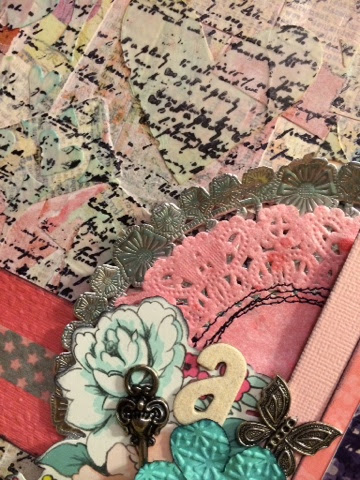
Hey Scrap Fans! I've been taking May Flaum's Camp Scrap 2014 and was inspired to make this mixed media canvas. 


I recently found this photograph of my grandmother when she was 4 1/2 years old. I thought a canvas would be a great way to showcase it. 


I started out with an 8x10 canvas and covered it with Mod Podge. I tore up pieces from the Basic Grey Out of Print and Simple Stories Year-o-graphs collections and layered them on the canvas.


I then covered the entire canvas with gesso. 


After the gesso was dry, I used washi tape to tape on a Heidi Swapp stencil and then covered it with molding paste. 


I applied a thin, even coat and removed the excess.


I removed the stencil and was left with this great textured canvas. 


I used black archival ink to stamp with text over the entire canvas. 


I sprayed a doilie with Heidi Swapp color mist and sewed it to a silver doilie from the July Studio Calico kit. I matted the photo and layered some embellishments around it. 


I'm very happy with the results and I hope you've been inspired to try using molding paste to add texture to your projects. Until next time, Happy Scrappin'!!


Thursday, July 3, 2014

Making the most out of paper pads

Hey Scrap Fans! It's July 2nd already and summer is in full swing. I'm still plugging away at my 100 layout goal, although I did more photo organizing in June than actual 12x12 layouts. I've also been working to organize my scrap room to better fit the way I work. It's been a process, but I'm gradually getting it the way I want it. 

My latest project was organizing my paper stash. I have vowed to limit myself to keep only the amount of paper that fits in a milk crate sized container. If I start to get too much, I have to weed out what I'm not going to use. This method has worked to keep my paper stash somewhat under control. 

I was storing my paper in a storage ottoman under my desk, but it often became the landing place for other stuff (including my feet) and I found it difficult to pull out and open when I needed paper. I wanted something shallow and on wheels so I could move it around and easily access my paper. I ended up with the open organizer cube by Recollections on the tray with casters. It's the perfect size and mobility for my paper stash. 


In order to keep my paper stash to my limit, I had to go through some of my paper pads and determine what I loved and what I knew I would never use. If a pad had multiples, nine times out of ten I kept one and got rid of one. I separated all the pads and stored the papers in plastic paper keepers by Cropper Hopper and I labeled them by manufacturer. 


When I was all done, I had the pad cover from the Dear Lizzy Daydreamer collection and it was just too cute to throw away. 


I have been taking May Flaum's Camp Scrap class and she was talking about grid designs and the pattern paper samples on this paper pad cover reminded me of a grid design. So rather than discard it, I cut out the parts I knew I could use and went to work. What resulted was this layout:


I cut out the middle 16 grids and put the rest aside for another project. I sprinkled some pink Heidi Swapp Color Shine on a sheet of white Studio Calico Cardstock and adhered my grid to the center. I printed six 2x2 square photos from a trip to the roller rink on my Canon Selphy. At first I was going to mount them directly over the squares of pattern, but it was much too busy, and the pictures got lost. So I cut a 4x6 piece from Amy Tan's Yes, Please collection and mounted the photos. I printed my journaling and mounted it on a piece of 2x4 pink pattern paper. 


I used the top three grids for my title, and used my Silhoutte Cameo to cut and piece a roller skate embellishment in the upper left. I used pink glitter on the skate toe and bow to create a visual triangle of pink with the skate, title and asterisk in the lower left corner. My letter stickers are from Webster's Pages, October Afternoon and American Crafts Thickers. 

I'm pretty happy with how this layout turned out. I still have some blocks of pattern left from the cover, plus all the pattern paper to work with. I hope you enjoyed this layout, and I hope you've been inspired to use some packaging or paper pad covers instead of throwing them out. Until next time, Happy Scrappin'!! 


Tuesday, June 24, 2014

Using Pocket Pages for Old Photos

Hey Scrap Fans! So I've recently started organizing all of my photos, which has proven to be quite an undertaking. I have over 30,000 digital photos that I'm tagging and sorting, not to mention all of the pre-digital hard copies. I'm working on it little by little as I work through deciding how I'm going to sort and store everything. 

So far my process with my older hard copy photos has been to first sort through the images and try to categorize in first broader and then more narrow categories. For example, I started with all of the photos I have of my high school years, then narrowed them down by smaller categories such as senior year, proms, etc. I had a lot of double prints and made the decision to throw away any duplicates. I also threw away any photo I couldn't identify or had no real meaning to me. One the pics were sorted, I scanned each group and tagged them with key words in Adobe Photoshop Elements. 

I then identified any pics that had a particular story I wanted to tell. These special photos will eventually get 12x12 layouts, so I slipped them in page protectors and put them in the appropriate album until I can get them scrapped. The other photos that I want to keep, but may not want to dedicate an entire layout to find a home in pocket page protectors. 

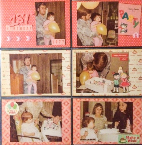
When I was growing up, my mom did a great job documenting my first year and my birthday parties in photos. She kept them all in the old sticky page photo albums, labeled the pages as to the theme and even trimmed some of the photos and rounded the corners. I recently starting tackling some of these photos of my childhood and used the above process to organize them. I disassembled the albums, scanned all the photos and tagged them and slipped them in pocket pages. 

Even though I have all the images scanned and can print them out as I decide to scrapbook them, I wanted to keep the originals. Here is what I did with the photos from my first birthday:

I used the We R Memory Keepers pocket page protectors and the October Afternoon Cake Walk collection in 8x8. I just love this nostalgic birthday themed paper and found it to be perfect for my 1970's pictures. I kept each card simple with a few stickers and embellishments fussy cut from the paper collection. 

Since these photos will be in albums with a lot of pictures, I wanted to keep the embellishments to a minimum to keep the pages flat and stream line. I couldn't help keeping some of this critter paper visible. I'm not much one for cutesy, themey paper, but this collection just really seemed to work. 


So with just a few pattern papers and some stickers, I managed to archive 19 photos. When I place them in my album with other 12 x 12 layouts, they'll fit right in. And instead of being in a shoebox, or a non-archival safe album, they can be easily browsed in my album. 

I hope you are inspired to use pocket pages for some of your old photos. Get them out of those boxes and into your albums. I promise, you'll be happy too did! Until next time, Happy Scrappin'!! 


Saturday, June 14, 2014

Happy Father's Day!


I'm taking a little break from scrapping this weekend while Libby and I visit Andy in Ohio. I hope everyone has a wonderful Father's Day. Happy Scrappin'!!

Wednesday, June 11, 2014

Sew Fun to Try Something Different

Hey Scrap Fans! Today's focus is on sewing. There are lots of different ways to add sewing to your pages, but no matter what way you choose, sewing can add that extra special touch you are looking for to take your pages to the next level. 

On this layout, created with the February Sugar Rush kit from Studio Calico, I used my machine to stitch down these vellum hearts and kraft arrows to form a vertical border. 


I created a background using punched stars and stitching them in rows on kraft cardstock. 


On this layout I shared in May, I stitched my misted paper to the background paper and pulled up the edges slightly to create a distressed look. 


I used my sewing machine to sew through vellum letters and elements to not only adhere them to the page, but to add visual interest as well. 


I used the embroidery templates from Amy Tangerine to trace embellishments on this layout and then hand stitched them with embroidery floss. 


And finally, I created a hand stitched border on this layout by piercing around the paper at even intervals and sewing with a needle and floss. 

There are so many ways to add stitching to your scrapbook pages. Whether you have a machine or just a needle and thread, the possibilities are limitless. I hope you've enjoyed these layouts and are inspired to try sewing on your pages. Until next time, Happy Scrappin'!! 


Friday, June 6, 2014

Fun with Circles

Hey Scrap Fans! Today's layout was another one I created for the Art + Science of Scrapboking class I'm taking at Big Picture Classes. I used something in this layout I pretty much never (if ever) do and that is circular photos. For some reason cutting my photos into circles reminds me of the early days of Scrapbooking when all the photos were cut up in to various shapes and sizes, layered with color paper and stuck on a page with themey stickers and premade border strips. But I wanted to try something different so I figured I'd give it a go. 


The concept of this layout was born when I was browsing my iPhone photos for a particular pic and in the process, discovered just how many Selfies my daughter takes of herself without me realizing. I found it rather humerous, and thought it would be a good topic to try using circular photos since cropping out the background wasn't a problem, since the focus was on her face up close. 

I chose not to further edit the photos other than to make them circles so I could preserve the various filters she had picked herself. If it were any other topic, I probably would have tried to unify the processing, but I felt the variety of filters better told the story visually. I edited the five pics in the Adobe Photo Shop Express app (free in the App Store) and printed them on my Canon Selphy. (Haha I printed selfies on my Selphy) 

I played around with a lot of different papers and color combinations on this layout before I settled on this background paper from the Glitz Wild & Free collection. I found my title "Selfie" in the Silhoutte store and cut it on my Silhouette Cameo on a sheet from a 6x6 pad from Dear Lizzy Daydreamer. I added letter stickers from Lily Bee Designs to complete my title. 

My matte circles were all cut on my Silhoutte from a sheet from the Carta Bella Wildflowers collection. I printed my journaling strips on another sheet from the Glitz collection and punched my heart embellishments from the coordinating background paper, only I used the one from the 6x6 pad to have the pattern in a smaller scale. I inked the edges of everything to unify my layout with Fountain Pen Ink by Jenni Bowlin for Ranger and a round ink blending tool. I finished it off with some epoxy puffy stickers from Amy Tangerine and I called it done. 

I hope you enjoyed this layout and you are inspired to try using circular photos. Remember, they work best when you are focusing close up on your subject and cropping out the background does not inhibit the story you are trying to tell.  Until next time, a Happy Scrappin'!!


Thursday, June 5, 2014

Packing a Colorful Punch

Hey Scrap Fans! Today's layout was inspired by a video in the "Inspired" series at Two Peas in a Bucket by Paige Evans:

http://www.twopeasinabucket.com/gallery/projects/videos/1987221-inspired-birthday-girl/ 

I loved the colorful clouds in this layout and thought it would be perfect for the pictures I took of Libby on her seventh birthday. 


Since Libby is a total ham and had to wear her rainbow tutu and birthday cake headband for her birthday, I knew this colorful rainbow pattern would suit these pics perfectly. I went through my scrap basket and picked out colors for the rainbow, punched the clouds with my Fiskars cloud punch (I used the medium one, I think Paige May have used the large). I inked all the cloud edges with Heidi Swapp brown archival ink and the new Tim Holtz round ink blending tool then layered them overlapping down the page. I decided to use two rows of each color so the pattern would be further down on the page. I adhered the clouds to this cloud paper from the Maggie Holmes Styleboard collection and then layered the three photos. I cut my title "Seven" from white core'dinations cardstock on my Silhoutte Cameo. I found the "Seven" in the Silhoutte store.  I added a few scattered embellishments here and there over their corresponding cloud colors. 

I hope you are as inspired by this layout as much as I was inspired by Paige Evan's. I encourage you to shop your scrap stash, pull out your punches and play with layering different shapes and colors. The possibilities are endless and the results are so much fun! Until next time, Happy Scrappin'!! 

Wednesday, June 4, 2014

Using Negative Space in Titles

Hey Scrap Fans! Today's layouts feature using negative space in your titles. Did you ever want to use a small font or cut a longer title with your die cutting machine but hate the thought of gluing down all those letters?  Sure, you could weld them together in your cutting software, but that doesn't always give you the look you want, especially with boxier fonts, and that takes a lot of time too. That's why sometimes I like to use the negative space left when cutting out letters. 

With this layout, I wanted to keep a graphic look and I knew exactly what size space I was working with for my title. Since I had a very subtle background paper, I cut out my title, "mom's favorite photo" and allowed the background paper to show through for a subtle look. I could have backed it with a more contrasting color if that's the look I wanted. 

The font I used works particularly well with negative space as the letters are mostly single unified shapes. You could always glue in the inner parts of the letters for fonts that may be harder to read. 

Here is another layout where I used the negative space for my title. I purposely left out the inner pieces of the letters since this is a layout about how we thought my daughter's two front teeth would never grow back in, so I found the gaps in the letters fitting. 


As you can probably tell, both of these layouts use papers from the same collection (My Mind's Eye Cut & Paste Adorbs) I frequently like to make several layouts at once using up as much of the pattern paper as I can. In those instances, I'll put together the foundation first and then look for a photo or story that I feel fits the mood of the paper. 

I hope you've been inspired today to try using negative space from die cuts on your layouts. Whether you have an electronic die cutter or a manual one, it's easy to create great titles for your pages and albums. Until next time, Happy Scrappin'!!


Tuesday, June 3, 2014

Editing and Showcasing Unique Photos

Hey Scrap Fans! As promised, today's layout showcases the uniqueness of a single photo. As I previously mentioned, my little sister went to her first prom in early May. Of course I took tons of photos of her and her date, but her dress was so unique, I really wanted to capture it without the distraction of awkward smiles and forced poses. So I snapped this pic of her from behind as she walked to the car. 


This was the original photo. 


I cropped the photo to eliminate some of the background distraction.  Next, I used an iPhone app called Color Splash ($1.99 in the App Store) This app turns your photo black and white, and allows you to selectively add color back in to your photo wherever you'd like. You simply run your finger over the area you want to color. You can zoom way into your photo to get clean lines and turn areas gray where necessary. It is a very easy app to use and I love the results. 


After I finished colorizing just the dress, I then save the photo and pulled it into Adobe Photoshop Express (free in the App Store, but does offer in-app purchases.) I changed the photo to sepia, brightened it and added a vignette.  I printed it straight from my iPhone to my Canon Selphy. I was ready for my layout. 


I wanted to keep the layout simple so I started with a whitewashed background paper (I'm sorry, I can't remember who makes it) and I layered up some patterned paper from a 6x6 paper pad from Basic Grey Indie Bloom. I also used two small strips of the sequin paper from Carta Bella Wildflowers. I used a Heidi Swapp stencil and inked stars around the edge of the paper with Tim Holtz Distress Ink in Picked Raspberry. I embellished with a few speciality clips and enamel dots and added a trendy, timely title #promdress with letter stickers. I finished it off by stamping the date with my a Pebbles roller date stamp in the same Distress ink. 

I just love enhancing and changing photos with the various apps available for photo editing. Special effects can really make that unique photo stand out on your layout. I hope you've been inspired to try some fancy photo work of your own. Until next time, Happy Scrappin'!! 

Comparison Photos

Hey Scrap Fans! Today's layout is one I made earlier in May the day of my little sister's first prom. I was taking pics of her in her dress, with her date and with various family members. Once I got home and was going through the photos I came across this one of my sister and my Dad and immediately thought of a photo of him holding her as a baby. And the following layout resulted:

I used papers from the Carta Bella Wildflowers collection, a collection I purchased for the cut apart cards, but ended up making quite a few layouts with it. My sister's dress was very colorful and I thought this sequin paper was just perfect. I used the 3x4 card with the sentiment "Photos are Memories we hold in our Hands" as my title as it just seemed perfect for these photos showcasing the passage of time.
I kept the embellishments simple, some stickers from the collection, wood veneer accents and sequins in opposite corners. 
I chose not to include any journaling on this layout as I really wanted the photos to speak for themselves. The dates, times and circumstances of the photos were not nearly as important to me as the visual image of the aging of the subjects.  If that's not something you are comfortable with, you could always add details to the back of your layout, or record your journaling on a hidden journaling card. 

I hope you ejoyed this simple layout today and it inspires you to find some comparison photos of your own to scrapbook. There are endless possibilities for these types of layouts, and they aren't just limited to photos of people. Stretch your imagination and see what you can come up with.  It helps to spend time with your photos and to give yourself the opportunity to make different connections. 

Tomorrow I will share another simple layout that showcases the uniqueness of a single photo. Until then, Happy Scrappin'!!

Sunday, June 1, 2014

One down, one to go


Hey Scrap Fans! Happy June 1. Of course since it is June 1, that means May is over and so is my time to complete my layout a day in May challenge. What, you ask? Did I complete my goal of 31 layouts in May? Why yes, yes I did. In fact, I did 37 layouts! (Plus a few procjet page spreads that I'm not sharing) 
Here are my results in no particular order:


Some of these I have shared already and some I will share at a later date. I'm really excited that I completed this challenge and I'm also looking forward to reaching my next goal of 100 layouts. I hope I can keep the momentum going, as I've been really inspired so far. I hope you'll continue to join me on my quest to 100 and until next time, Happy Scrappin'!!