
I will admit to having many loves when it comes to crafting. I want to roll around in piles of just about anything that Ranger sells, the grungy happy look of 7 gypsies makes me go weak in the knees, and I could go on and on.

Today I made a tag with another of my loves: Perfect Pearls by Ranger. For whatever reason, Perfect Pearls don't seem to get the love that the other Ranger products do. I'm going to choose to believe that it is because not everybody knows about the many uses of them. I mean, let's face it: they are a very fine powder in a small jar. I know that once upon a time, I just assumed they were embossing powders, and was pretty unhappy when they didn't act the way that embossing powders do. So let's see just how beautifully they lend themselves to a project!
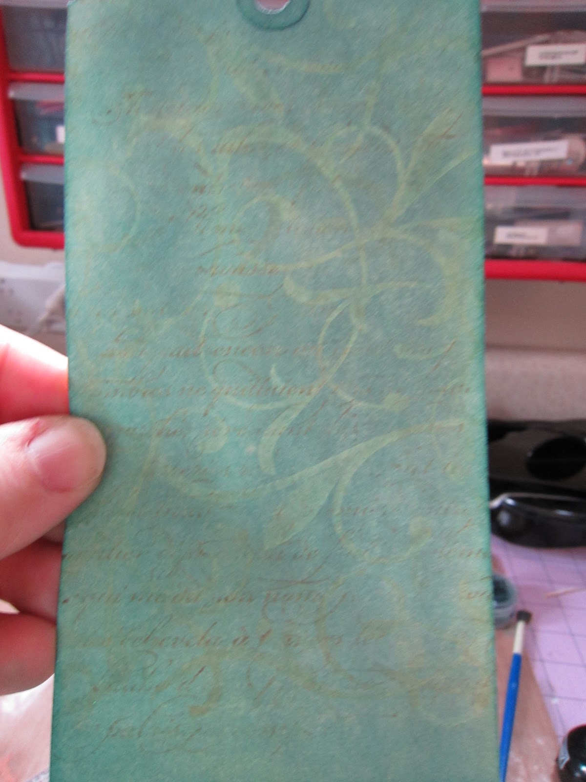
First thing I did was ink the entire manilla tag in broken china distress ink (I have a thing with blues, I'm not sure if you've noticed yet).

Then it's time to get out the Perfect Pearls. I used Blue Patina (because as I've said - the thing with blues). I took a perfect pearls brush and applied a thin coat of the pearls all over the tag. The Perfect Pearls come separately (in little jars like this) or you can get them in kits with four coordinating colors, two brushes, and the perfect medium ink pad that you use with them. I used the larger brush that comes with the kit since detail wasn't an issue and I had a lot of ground to cover. This is what it looked like when I was finished:

Next, I took the perfect medium ink and applied it all over this background stamp by Hero Arts. Perfect Medium is a clear ink with a bit of stickiness to it.

I then stamped the image onto the tag with the perfect pearls on it. The perfect medium picks up the perfect pearls and sticks to the background stamp so that the color underneath shows through. On this tag, there was a very subtle difference because I used two similar shades of blue. If I had used two contrasting colors the difference would have been much more striking. (I'm also into subtle though).

I went ahead and stamped some brushed corduroy distress ink onto a french script stamp (this one is from Stampin' Up!) very haphazardly. I wanted a very distressed look on the tag, so I wasn't carefully about making sure that every piece of the tag was covered with the image.

When I want to get a distressed look, I often will put my project directly onto the stamp and just kind of 'finger walk' over a few parts of the tag.

This is the result. Just a very light stamped image that breaks up in spots.
I'm starting to sound a little like a broken record now, but I also really like the tissue tape that Tim and Ranger make (and if you've been reading the blog you already know my feelings about the distress stains). So, here I took a length of the tissue tape and unrolled it onto my craft mat (I didn't tear it off the roll though). I colored it with broken china distress stain, and because I am impatient, heat it until dried.

I carefully rolled the tape back onto the roll (really not as difficult as it sounds, and I do this anytime I color my tissue tape) and I applied it to the bottom of my tag. I made little pleats with the tape as I went.

This butterfly stamp comes from a set by Prima. I inked it with dried marigold. Those are Tim's stamp blocks that I'm using with the stamp. They are simply brilliant!

I dabbed a tiny bit of the broken china stain over the outside edges of the butterfly stamp.


I am way too lazy to look in my crazy huge ribbon stash to look for something that will match my tag perfectly, so I made my own with seam binding and glimmer mists.


I popped my butterflies up with some pop dots, tied my ribbons onto the tag, and stamped on the tag using vintage photo distress ink and a stamp that a local woman made for me a while back.

And the finished result is here:

In real life, you can see the details much better (I swear!). So I hope that you enjoyed this blog post, and I'll be doing more with perfect pearls again soon.
Thanks for visiting, everybody!
No comments:
Post a Comment